
Central Limit Theorem
Introduction
Overview
I want to talk about the Central Limit Theorem (CLT) in this post since it’s one of those things that I’ve heard so much about and tried to learn it three times without success. The turning point was completing the course project from the Coursera Data Science Specialization Course 6 Statistical Inference. This also demonstrates why doing projects are one of the best ways to learn data science! In any case, this post also acts as a course note for me so that if I ever forget what CLT is, I can refer back to these notes. Basic knowledge of mean, variance, and distribution would be really helpful in understanding the rest of this post.
We will be doing a simulation exercise, in which 40 random samples will be drawn from an exponential distribution and the mean will be calculated for each sampling. The sampling will be repeated 1,000 times to generate 1,000 sample means. We will then investigate the distribution by calculating the mean and variance of the sample means, and compare that to the theoretical mean and variance derived from CLT.
The Central Limit Theorem
Simply put, CLT states that when independent random variables are sampled from a population, the distribution of the sample mean will approximate a normal distribution regardless of the distribution of the variables themselves. If this sounds like a mouthful to you, don’t worry - I didn’t understand a word the first three times when I was sitting in a classroom! Hopefully, by the end of this simulation exercise, how CLT plays a role in interpreting the sample mean distribution will be clear.
Significance
Why do I care about the distribution of the sample means? This section uses a real-world example to explain how sample mean distribution is used to estimate the population mean that is unknown to us.
Imagine that we want to know the average height of women who went to college. My undergrad actually did this study and found out that women in my college are ~2 inches shorter than the national average! It would probably take a lot of time and money to collect the height of every single woman with a bachelor’s degree to calculate the average height, so we are going to estimate the average height instead. In other words, we will use sample means to infer the population mean. You probably guessed how this can be done. We can simply measure the height of say 50 people and take the average - that’s one estimate of the average height.
Here’s the thing with guessing: the more times you guess, the more estimates you have, and the more likely you are to guess correctly. We would want to have multiple estimates of the average height, in the hopes that at least one would be close to the population mean. So if we repeat this process 1,000 times, we would have 1,000 estimates of the average height, each of them probably slightly different from the other. Which one should we believe then? An intuitive way is to take the average of the 1,000 sample means and use that to estimate the average height of women who went to college.
But how do I know if 1,000 sample means accurately represent the height of all women with a bachelor’s degree? Should I get more, say 10,000 sample means? Or is 100 enough? This is where calculating the variation of the 1,000 sample means, aka the standard error of the mean, comes into play. The standard error of the mean allows us to evaluate how accurate the 1,000 sample means represent the height of women who went to college.
So now you have it, we care about the sample distribution (sample mean and variance) because we don’t know the true mean. We use the average of the sample mean to infer the population mean, and we use standard error to evaluate the accuracy of our estimate.
Simulation
The exponential distribution
The exponential distribution can be simulated in R with rexp(n, lambda), where n is the number of observations and lambda is the rate. The mean and the standard deviation of the exponential distribution is both 1/lambda. We will set lambda = 0.2, sample 40 exponentials from the distribution, and take the mean; this process will be repeated 1,000 times to generate 1,000 sample means.
Expected outcome
When I plan out an experiment, I always like to expect what the outcome would be like so that when it doesn’t behave the way I assumed, I know something is wrong.
Coming back to the simulation exercise, based on our understanding of CLT, the distribution of the 1,000 means will approximate a normal distribution. This indicates that the average of the sample means will be close to the mean of the population mean (theoretical mean), 1/lambda, and the variance of the mean should approximate the theoretical variance, population variance/sample size. However, if we simply plot all 40 * 1,000 = 40,000 samples, they will take the distribution of the population - an exponential distribution! See how cool the Central Limit Theorem is? Even though the samples are exponentially distributed, their means are normally distributed.
Of course, these are my expectations of the simulation results. Now let’s get our hands dirty and start coding!
Data generation
- Set the parameters for performing the simulation
- Run the sampling 1,000 times, each time calculating the mean of 40 samples drawn from the exponential distribution and saving it to
meanSim1K. For reproducibility purposes,set.seed(2) - For clarity, sample refers to individual variables drawn from the exponential, while sample mean refers to the 1,000 calculated averages from each sampling
library(ggplot2)
library(cowplot) #for panels in ggplot2

lambda <- 0.2 #rate
sampleN <- 40 #number of samples
simN <- 1000 #simulations

set.seed(2) #for reproducibility purposes
meanSim1K <- replicate(simN, mean(rexp(sampleN, rate = lambda)))
Theoretical distribution vs sample distribution
- The mean of the exponential distribution is
1/lambda(theoretical mean) and the mean of the 1,000 sample means can be calculated viamean(). To reiterate, we took the mean of 40 randomly-drawn samples and repeated that for 1,000 times. Therefore, we are taking the average of 1,000 sample means. You can see that the population mean (5) is very close to the mean of the sample mean (5.02)
1/lambda #theoretical mean
## [1] 5
mean(meanSim1K) #mean of sample means
## [1] 5.016356
- The theoretical variance is the expected variance from the sample mean. Based on CLT, it can be calculated by
population variance/sample number. This is a bit complicated but in simple terms, since we are estimating the population mean, the more guesses we make, the more information we have, and the more accurate our estimates are. Hence, as the sampling proceeds, the sample means will cluster closer around the population mean, leading to a variance smaller than the population variance. The square root of the variance of the sample mean is called standard error of the mean (SEM). You can read more about SEM on Wikipedia. Just a side note, normally we don’t know the true population mean and variance, so SEM is estimated by thesquare root of (sample variance/sample number). Here, since we know that our population is exponentially distributed, we can calculate the true variance. - On the other hand, the variance of the sample mean can be calculated via
var(). Again, here we are looking at the variation of the 1,000 sample means. Similarly, the theoretical variance (0.625) and the sample mean variance (0.669) are very close to each other
1/(lambda**2)/sampleN #theoretical variance
## [1] 0.625
var(meanSim1K) #variance of sample means
## [1] 0.6691305
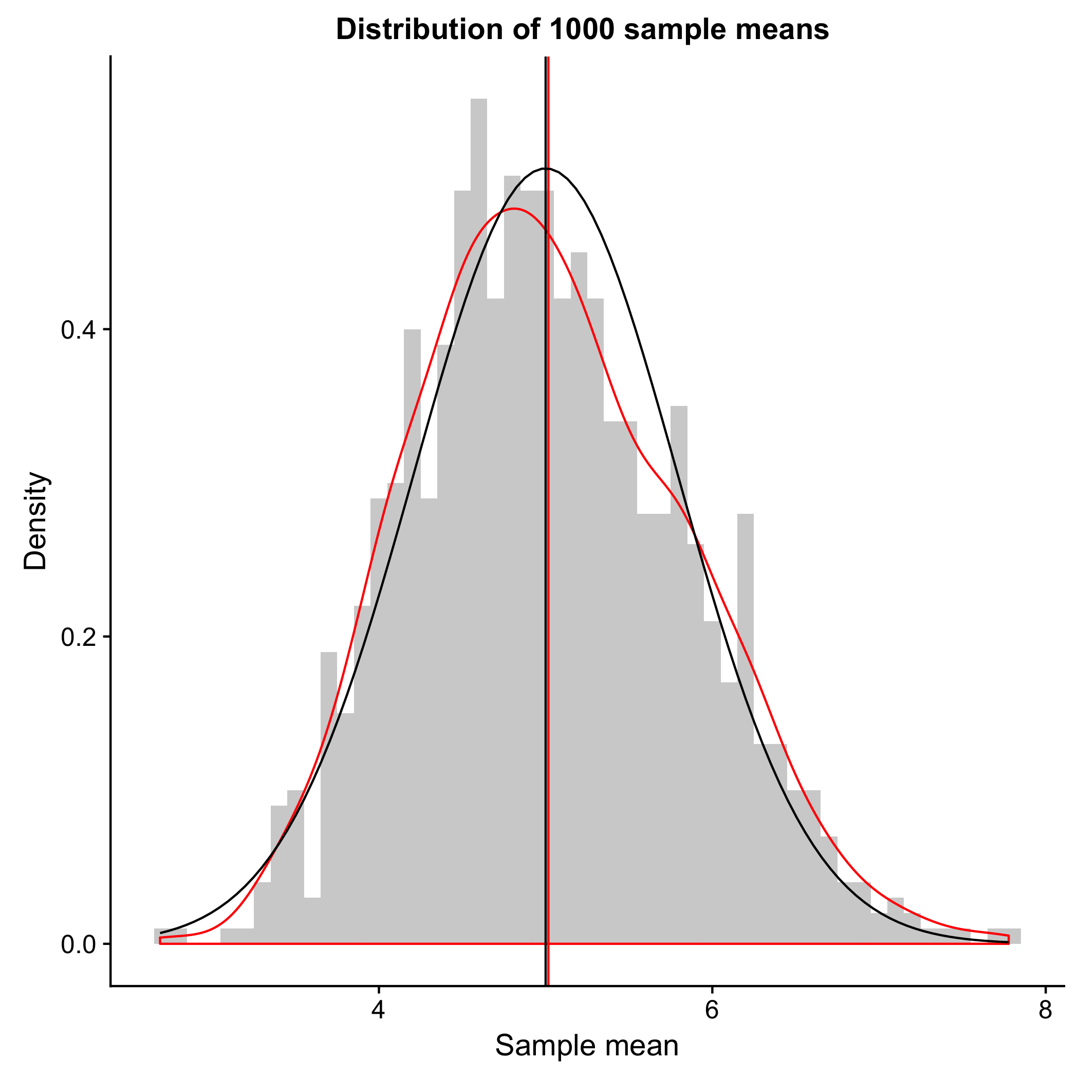
- With the above calculation, hopefully I have convinced you that the distribution of 1,000 sample mean does follow CLT and shows a normal distribution. This is also evident in the plot below, where the distribution of the sample mean from sampling 1,000 times (red) approximate the normal distribution (black). The horizontal lines indicate the means, and as shown above, the sample mean (red) and the theoretical mean (black) are very close to each other. More importantly, even though the samples are taken from an exponential distribution, the sample means have a normal distribution; this is the Central Limit Theorem.
ggplot(data = as.data.frame(meanSim1K), aes(x = meanSim1K)) +
  geom_histogram(binwidth = 0.1, aes(y = ..density..), alpha = 0.3) +
  geom_density(color = 'red') + #density curve of the sample distribution
  geom_vline(xintercept = mean(meanSim1K), color = 'red') +
  stat_function(fun = dnorm, args = list(mean = 1/lambda, sd = 1/lambda/sqrt(sampleN)), color = 'black') +
  geom_vline(xintercept = 1/lambda, color = 'black') +
  xlab('Sample mean') +
  ylab('Density') +
  ggtitle('Distribution of 1000 sample means ')
Revisiting CLT
I just want to drive home the point that the distribution of the sample mean and the distribution of the samples are two very different things. Let’s look at the following the two scenarios and compare the distributions of
- 30 random exponentials (A) vs the mean of 40 random exponentials repeated 30 times (B)
- 1,000 random exponentials (C) vs the mean of 40 random exponentials repeated 1,000 times (D)
set.seed(5)
simId30 <- replicate(30, (rexp(1, rate = lambda))) #get 30 random samples
simN30 <- replicate(30, mean(rexp(sampleN, rate = lambda)))
 #get 40 random samples and repeat 30 times

simId1000 <- replicate(1000, (rexp(1, rate = lambda))) #get 1000 random samples
simN1000 <- replicate(1000, mean(rexp(sampleN, rate = lambda)))
 #get 40 random samples and repeat 1000 times
Can you guess the distributions of (A), (B), (C), and (D)?
p1 <- ggplot(data = as.data.frame(simId30), aes(x = simId30)) +
        geom_histogram(binwidth = 0.1, aes(y = ..density..), alpha = 0.3) +
        geom_density(color = 'red') + #density curve of the sample distribution
        geom_vline(xintercept = mean(simId30), color = 'red') +
        stat_function(fun = dexp, args = list(rate = lambda), color = 'black') +
        geom_vline(xintercept = 1/lambda, color = 'black') +
        xlab('Sample') + ylab('Density') +
        xlim(c(0, 40)) + ylim(c(0, 0.5))

p2 <- ggplot(data = as.data.frame(simN30), aes(x = simN30)) +
        geom_histogram(binwidth = 0.1, aes(y = ..density..), alpha = 0.3) +
        geom_density(color = 'red') + #density curve of the sample distribution
        geom_vline(xintercept = mean(simN30), color = 'red') +
        stat_function(fun = dnorm, args = list(mean = 1/lambda, sd = 1/lambda/sqrt(sampleN)), color = 'black') +
        geom_vline(xintercept = 1/lambda, color = 'black') +
        xlab('Sample mean') + ylab('Density') +
        xlim(c(2, 8)) + ylim(c(0, 1))

p3 <- ggplot(data = as.data.frame(simId1000), aes(x = simId1000)) +
        geom_histogram(binwidth = 0.1, aes(y = ..density..), alpha = 0.3) +
        geom_density(color = 'red') + #density curve of the sample distribution
        geom_vline(xintercept = mean(simId1000), color = 'red') +
        stat_function(fun = dexp, args = list(rate = lambda), color = 'black') +
        geom_vline(xintercept = 1/lambda, color = 'black') +
        xlab('Sample') + ylab('Density') +
        xlim(c(0, 40)) + ylim(c(0, 0.5))

p4 <- ggplot(data = as.data.frame(simN1000), aes(x = simN1000)) +
        geom_histogram(binwidth = 0.1, aes(y = ..density..), alpha = 0.3) +
        geom_density(color = 'red') + #density curve of the sample distribution
        geom_vline(xintercept = mean(simN1000), color = 'red') +
        stat_function(fun = dnorm, args = list(mean = 1/lambda, sd = 1/lambda/sqrt(sampleN)), color = 'black') +
        geom_vline(xintercept = 1/lambda, color = 'black') +
        xlab('Sample mean') + ylab('Density') +
        xlim(c(2, 8)) + ylim(c(0, 1))

plot_grid(p1, p2, p3, p4, labels = 'AUTO')
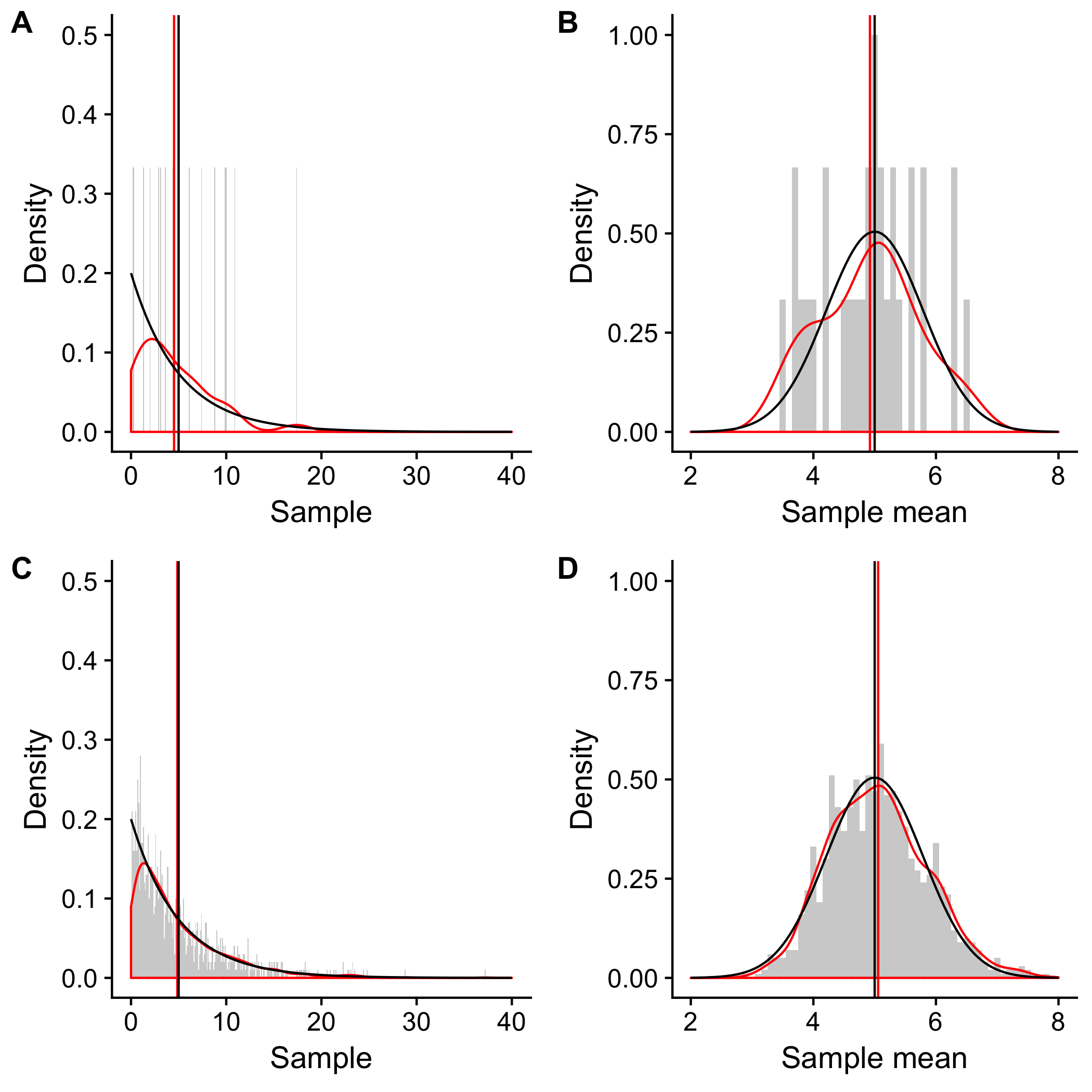
As shown in the figure, (A) and (C) are the distributions of 30 and 1,000 randomly selected exponential samples, respectively. Hence, they resemble a distribution of the population, an exponential distribution (black). As the sample size increases from 30 to 1,000, the sample distribution becomes more similar to the exponential distribution (red).
In (B) and (D), the distributions of 30 and 1,000 sampling of means taken from 40 exponential samples resemble a normal distribution (black). As the simulations increase from 30 to 1,000, the sample mean distribution becomes more similar to the normal distribution (red).
I hope this post is sufficient to give a rough explanation of the importance of CLT. As always, please feel free to send me your feedback via comments or email!

Leave a Comment
Your email address will not be published. Required fields are marked *